



- Client
- Auto-Klinika
- Role
- Design, frontend development and ongoing maintenance
- Scope
- Product design, UX, frontend engineering and ongoing maintenance
- Year
- 2020—2026
- Tools
- AstroTypeScriptReact 19GSAPWebGLNetlify FormsJestPlaywrightFigma
- Website
- View Live Page
- Design
- View in Figma
Context
I evolve existing products without disrupting what already works for the business.
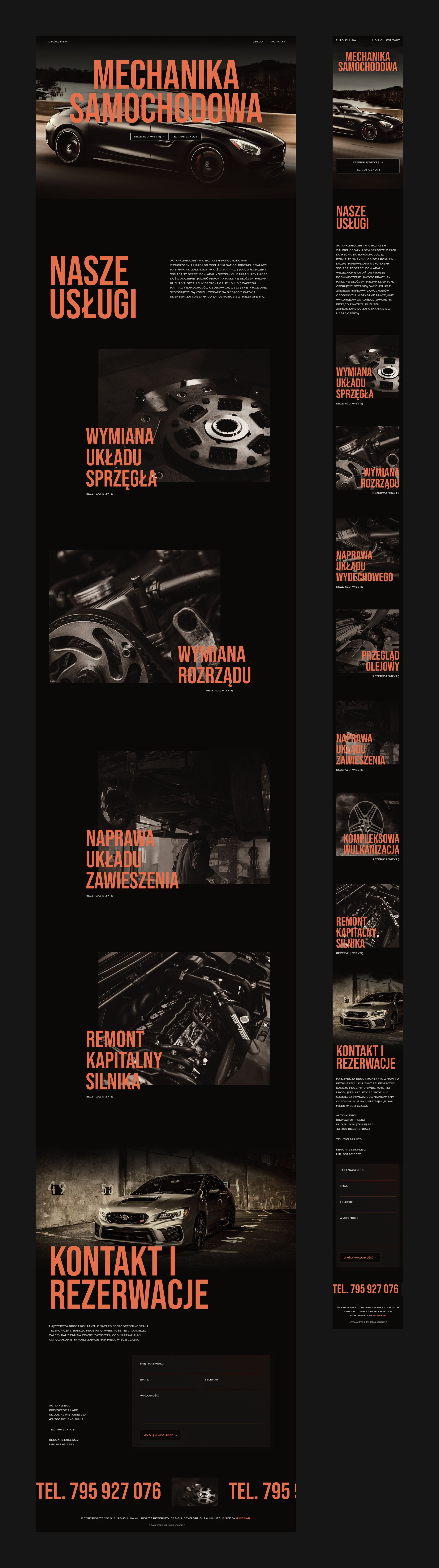
Auto-Klinika is a car repair workshop in Bielsko-Biała. The team is usually busy with cars, so the site I designed in 2020 is built around phone calls, with a tap-to-call number in the hero and contact section and an enquiry form for customers who prefer to write.
By 2026 the customer experience was still doing its job, but its technical foundation was no longer supported. The challenge was to preserve a familiar customer journey while replacing the technical foundation underneath it.
Having designed, built and maintained the site for six years, I led its rebuild when the original foundation was no longer sustainable. I kept the established customer journey intact and rebuilt the ageing Vue/Gridsome frontend in Astro with a deliberately small client-side footprint. Along the way, I connected interaction design, accessibility and frontend implementation, and created a shared vocabulary between Figma variables and production CSS.


This is how Auto-Klinika evaluated my work
Kasia understands our business and knows how to turn our needs into practical, modern digital solutions. We have relied on her for our website since 2020, from design and development to ongoing improvements, and have always been very happy with her work.
Approach
Preserve what worked. Rebuild what didn’t.
A visual redesign would have introduced change where there was little evidence of a customer problem. Instead, I kept the existing content, service structure, contact model and visual identity, and focused the redesign effort on the interaction layer and technical foundation.
The site was rebuilt in Astro with a deliberately small client-side footprint.
The visual experience was refreshed through photography, motion and interaction. I regraded the photography so it works as one visual set and created separate landscape and portrait crops for different viewport contexts.
The hero follows the user’s scroll from the road towards the workshop. Service photography uses a custom WebGL reveal, while scroll-driven typography and the phone-number marquee reinforce the relationship between movement and the workshop’s physical environment.
These effects are progressive enhancements rather than dependencies. With reduced motion enabled, the animation disappears and the page remains fully usable, readable and navigable.
The result is a site that feels new without asking existing customers to learn a new way of using it.

Design system
One design language from Figma to production.
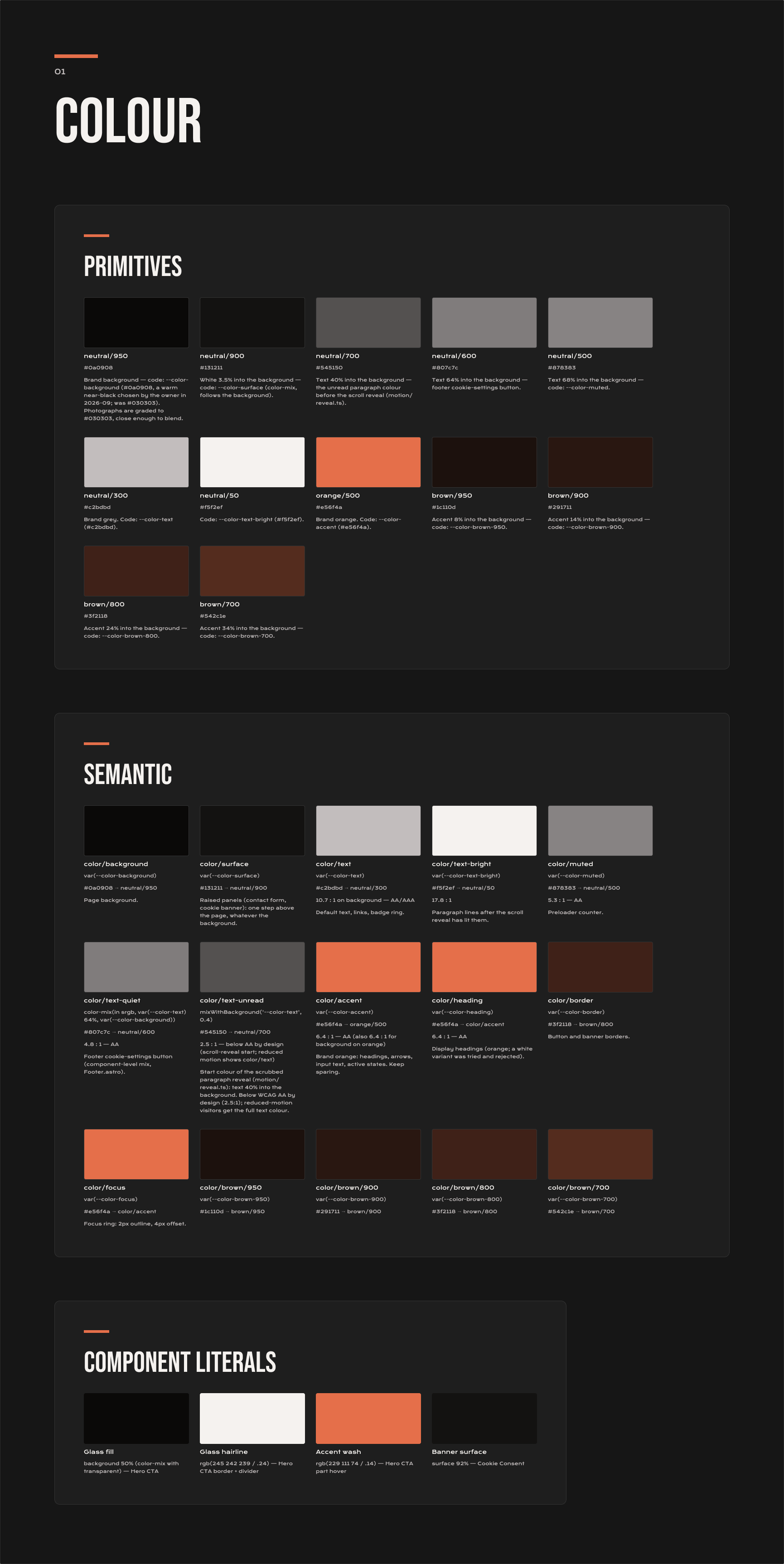
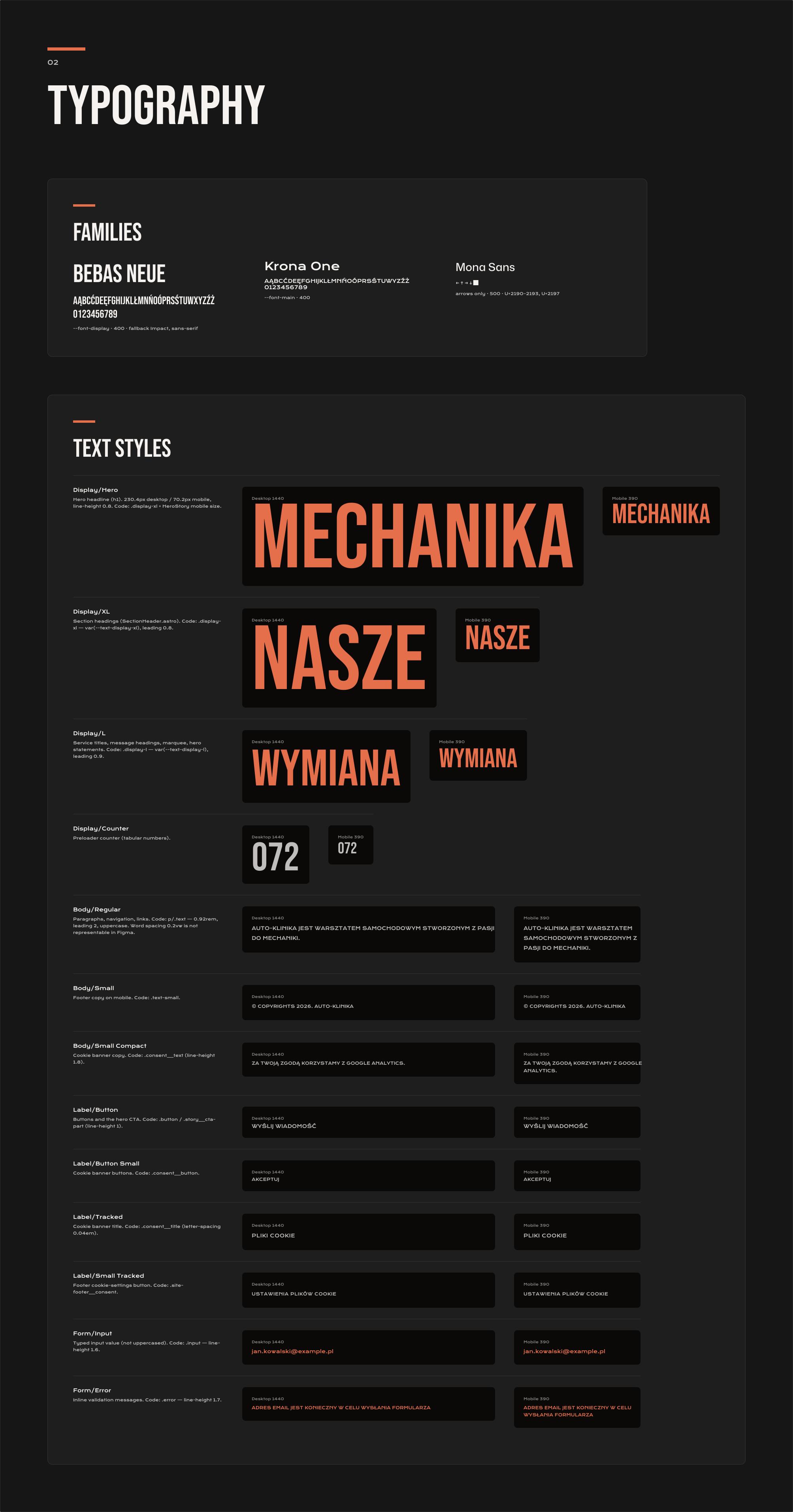
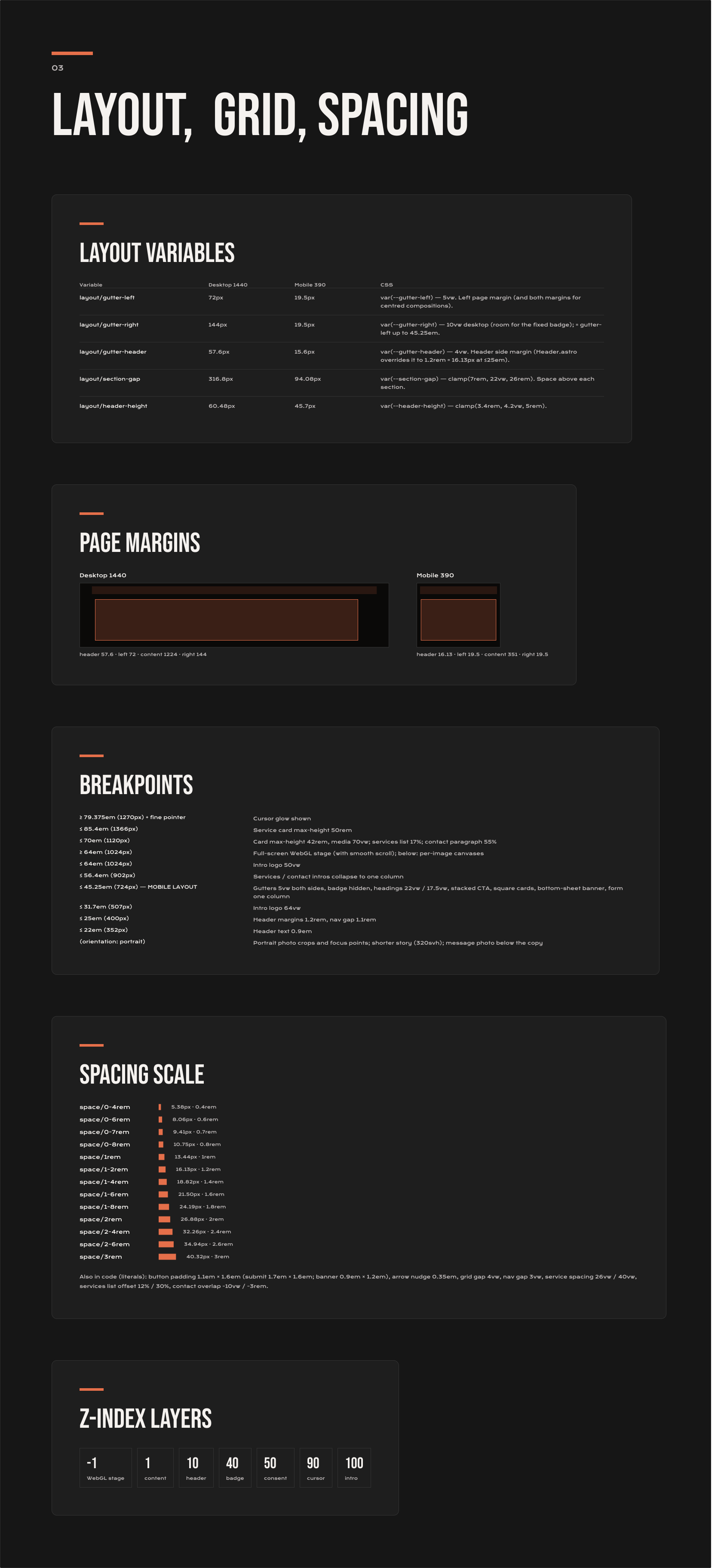
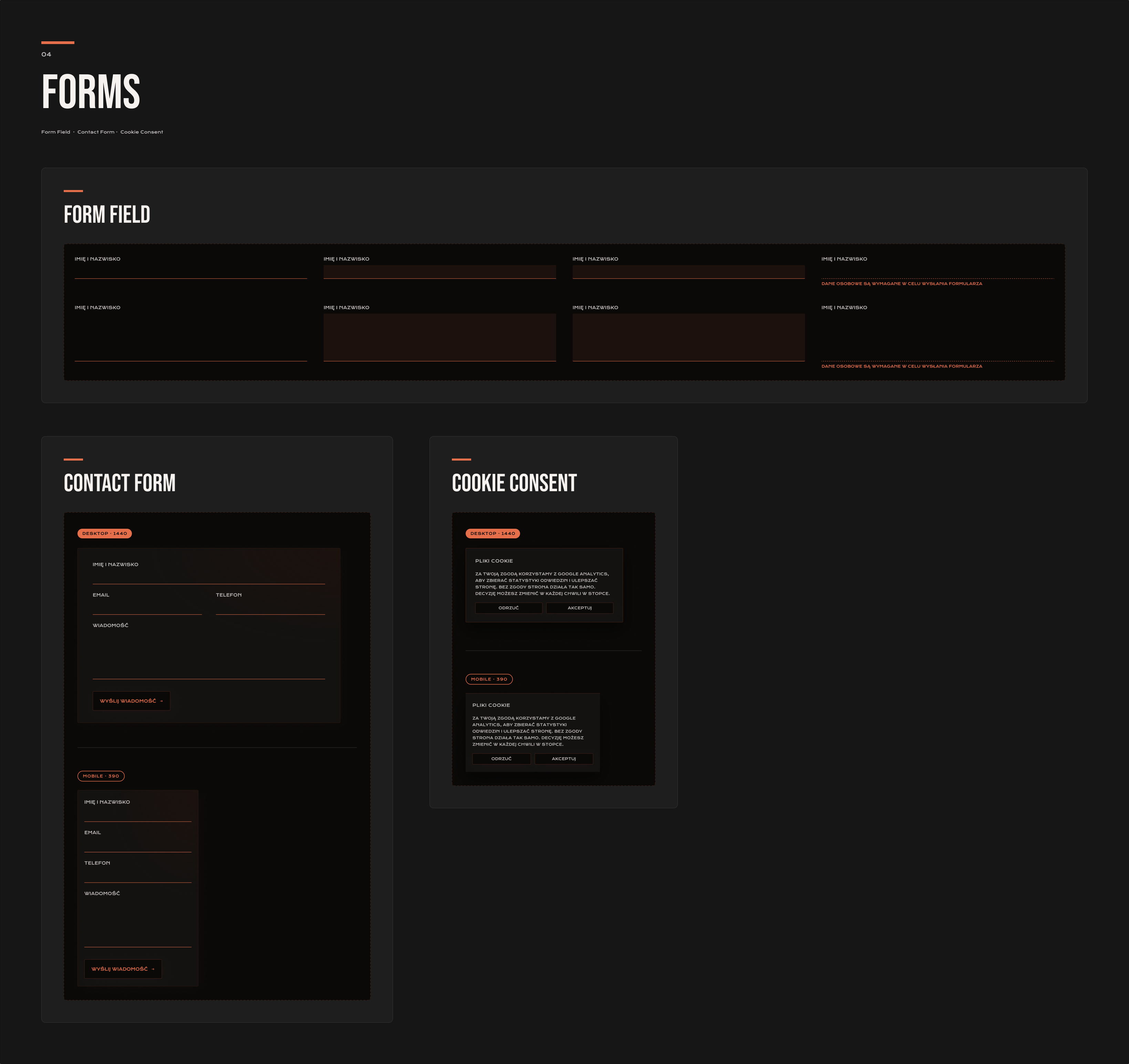
The site’s colours, typography, spacing and component values are defined in Figma as variables and text styles, with corresponding names in the production CSS.
This creates a direct relationship between the design system and implementation: a designer can identify the production variable behind a Figma value, and a developer can trace a CSS token back to its design definition.
For a product I continue to maintain, this reduces ambiguity and makes future changes less dependent on remembering how individual values were originally implemented.
Accessibility is part of the system rather than a final-stage check.
The colour documentation records contrast ratios for the interface. One intentionally sub-AA treatment is used for the muted text state during the scroll reveal. The exception is isolated to that interaction and is removed entirely when reduced motion is enabled. Automated accessibility checks prevent similar contrast issues from appearing elsewhere.




Outcome
A familiar customer experience on a maintainable production foundation.
The rebuild preserved the customer journey that worked for the business while replacing the technical foundation that had become difficult to maintain.
The resulting site is delivered primarily as static HTML, with React used only where interaction requires it. The enquiry form is loaded when it becomes relevant and remains functional without JavaScript.
The first view is 264 KB on desktop and 440 KB on a phone. Images are delivered in modern formats with responsive crops, while content further down the page is loaded as it approaches the viewport.
The production build is tested across Chrome, Firefox and Safari, with additional coverage on Android and iPhone. Automated checks cover console errors, failed requests, accessibility issues and page-weight budgets.
This gives the site more than a new visual layer: it gives a long-running production product a technical foundation that can continue to evolve without accumulating the same constraints that led to the rebuild.

