


- Client
- Dom-Meszna
- Role
- Art direction, UX and frontend development
- Scope
- Art direction, UX, interaction design and frontend engineering
- Year
- 2026
- Tools
- Next.jsReact 19TypeScriptTailwind CSSGSAPNetlifyFigma
- Website
- View Live Page
- Design
- View in Figma
Context
Selling the property without making it feel like a listing.
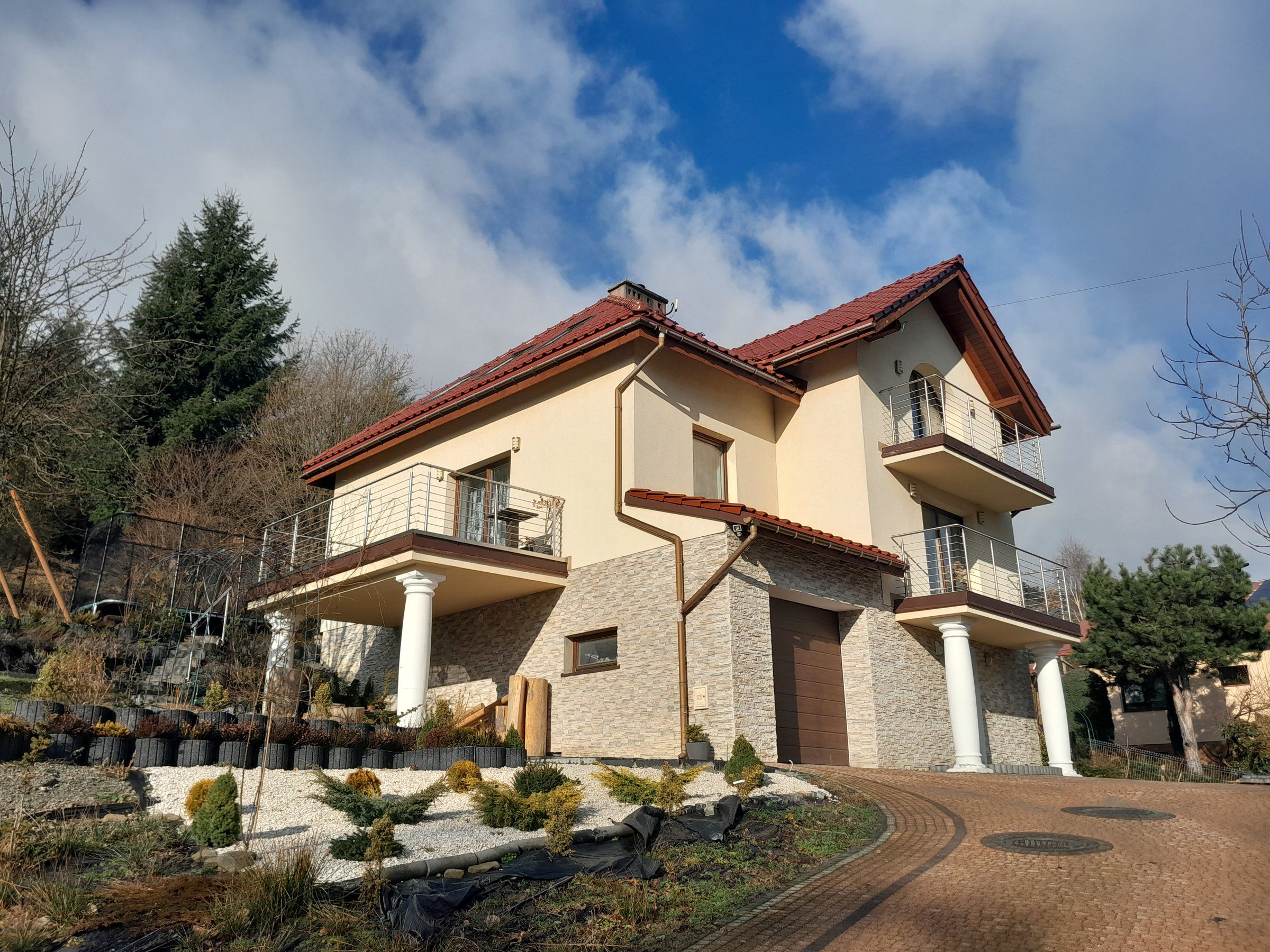
Dom-Meszna is a 402 m² house in the Beskid Śląski, and its owner is selling it directly, without an agency.
On a property portal it would be one listing among hundreds, a row of thumbnails and a spec table competing with every other house on the page. The goal was to give it the presentation you’d expect from a premium agency and still have buyers talk to the owner directly.
So the house and its view of the mountains had to make the first impression, and the facts a buyer needs had to stay easy to find. The one thing the site asks visitors to do is arrange a viewing with the owner.

Approach
Let the property make the first impression.
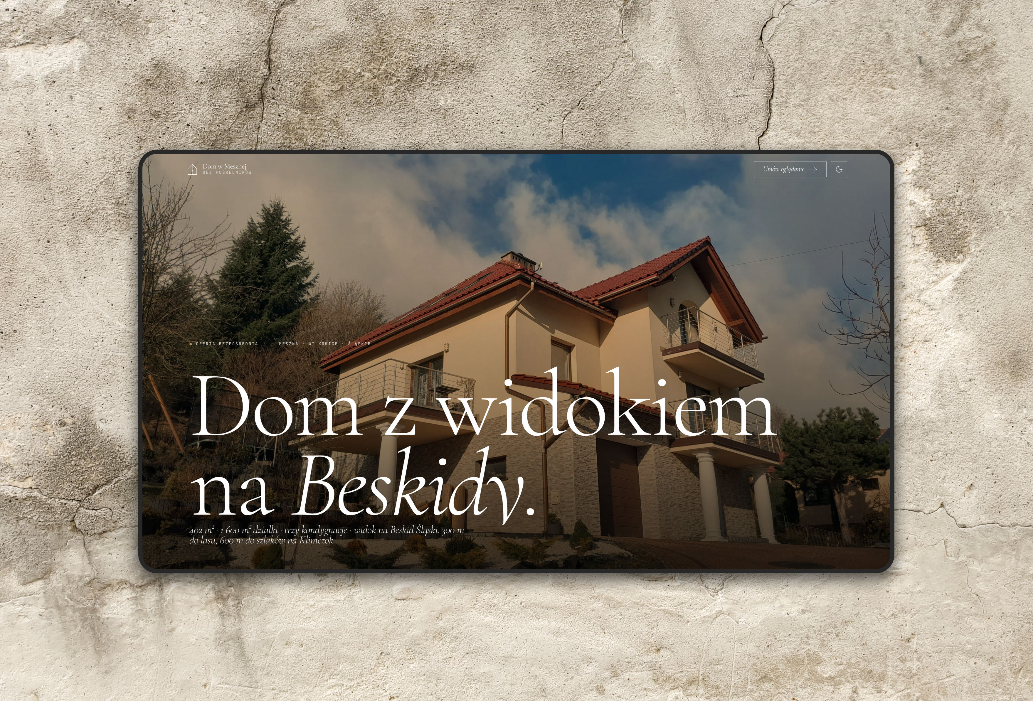
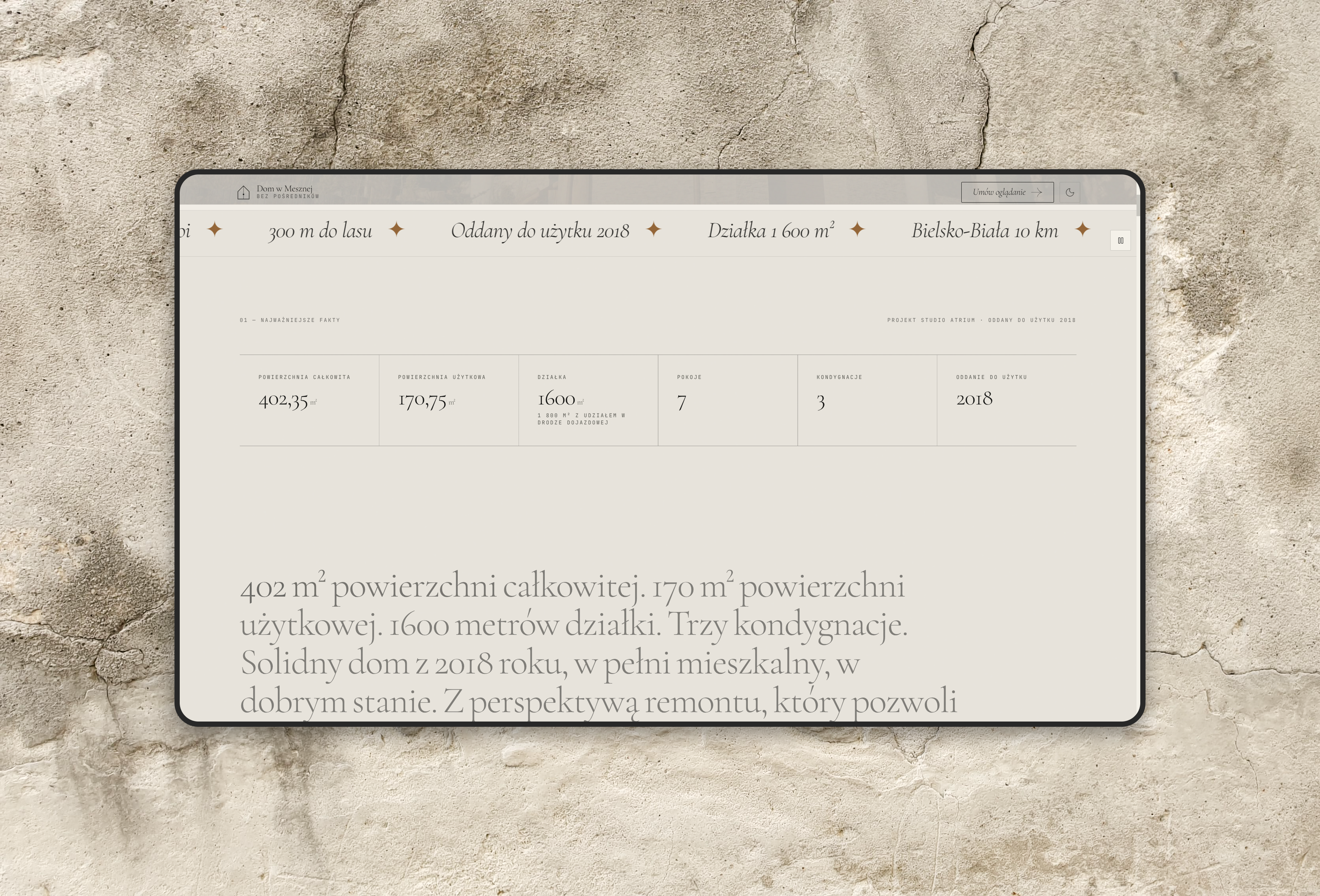
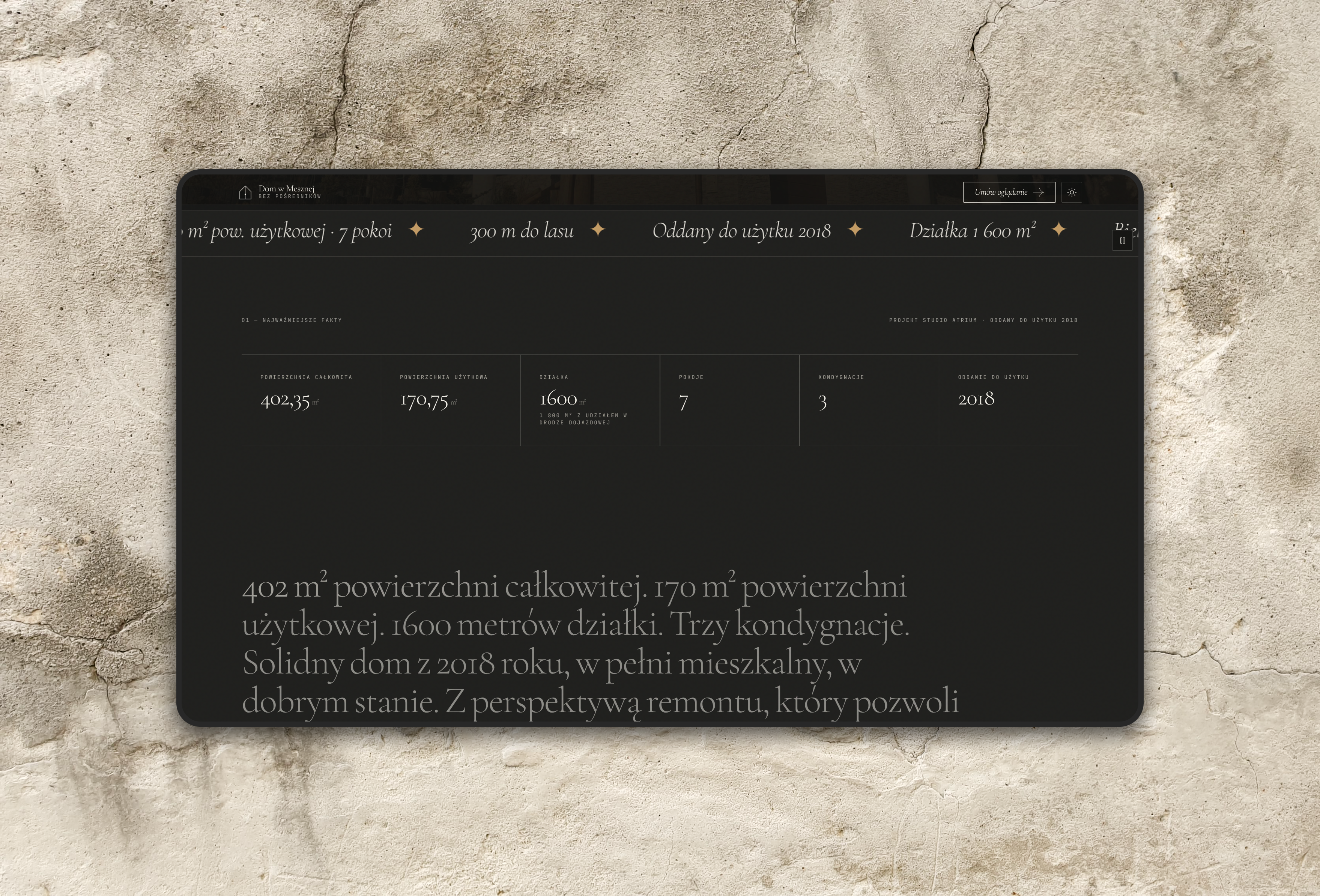
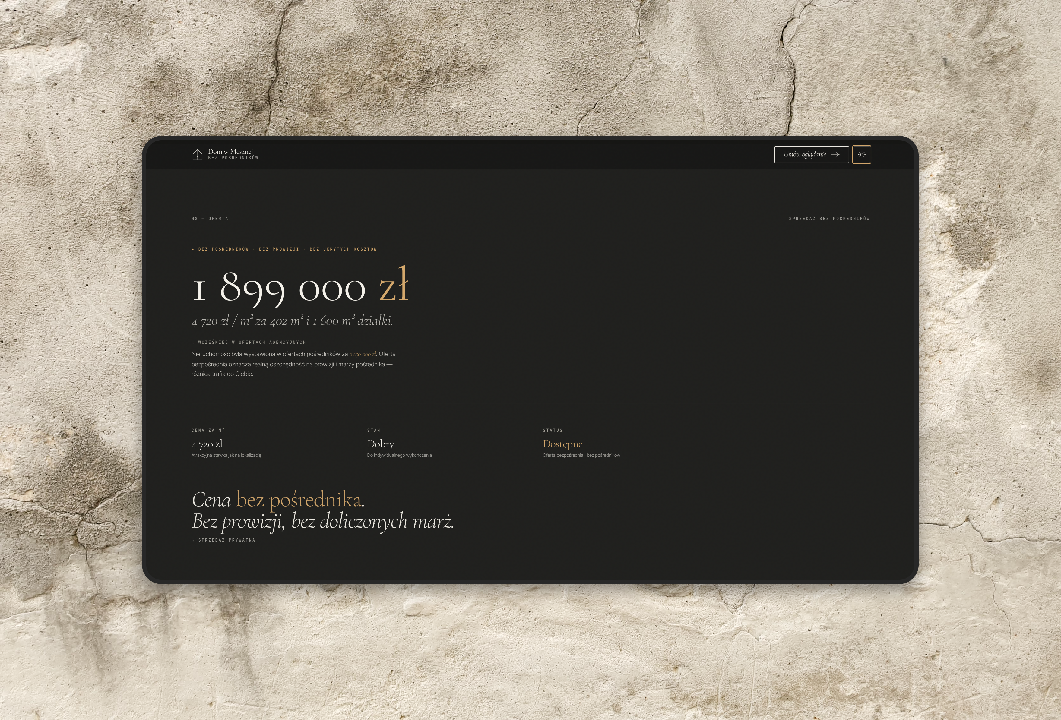
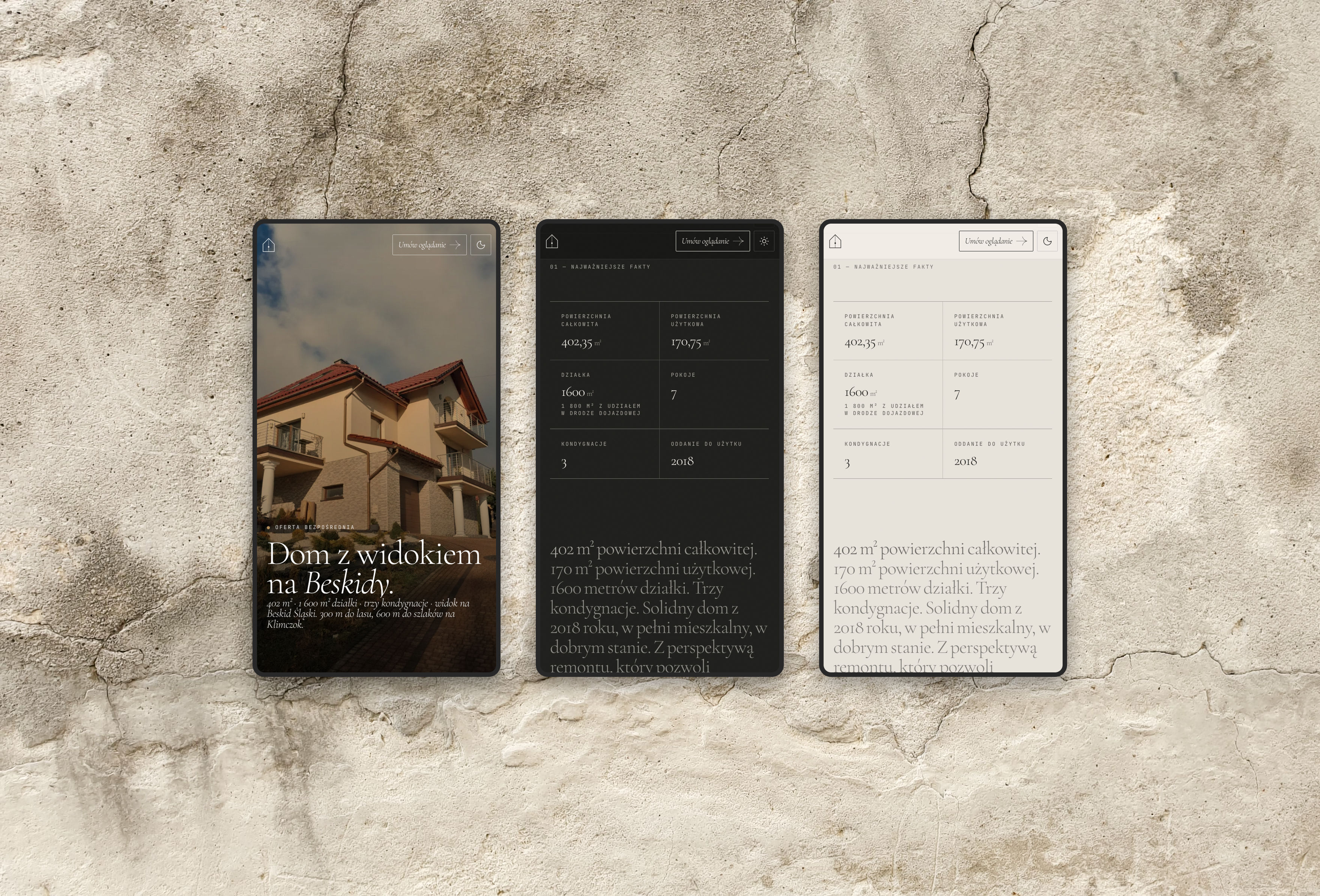
Portal listings open with a grid of thumbnails and a specification table. This site opens on a full-width photograph of the house, with the key figures in one line under the headline. The facts get a section of their own just below it, so nobody has to scroll through photos to find the floor area or the size of the plot.
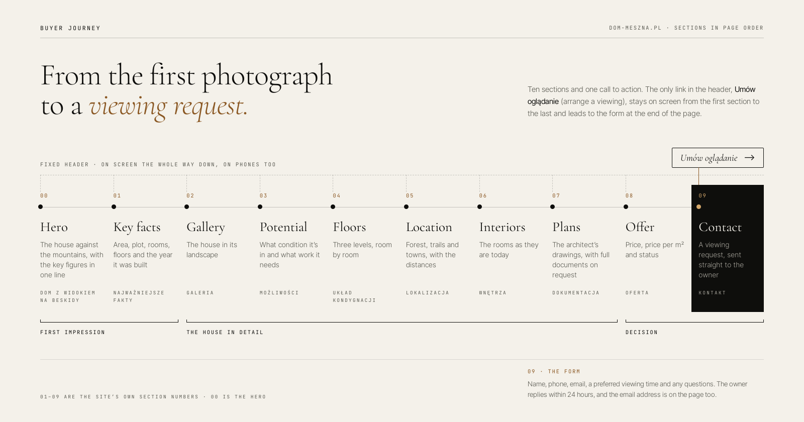
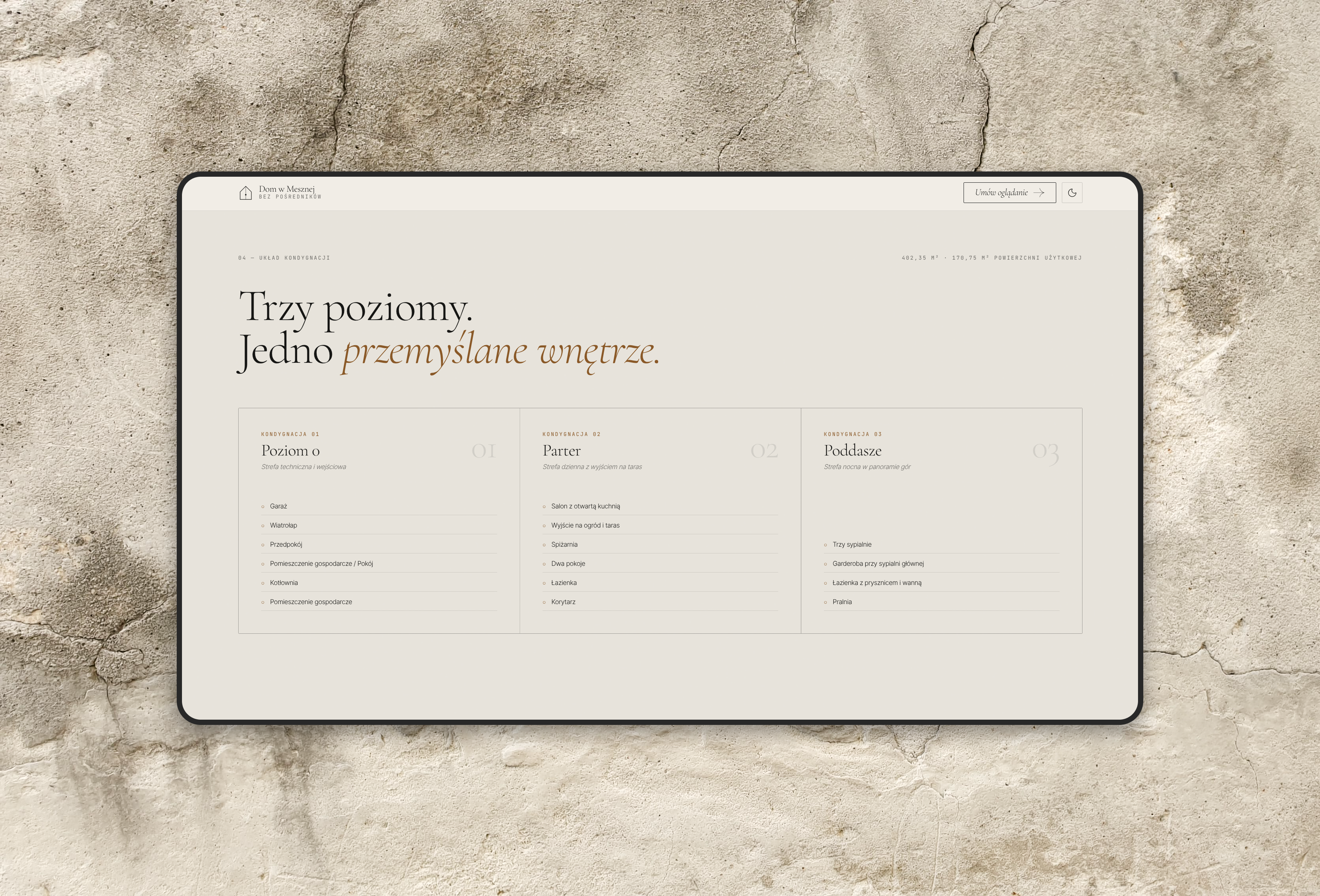
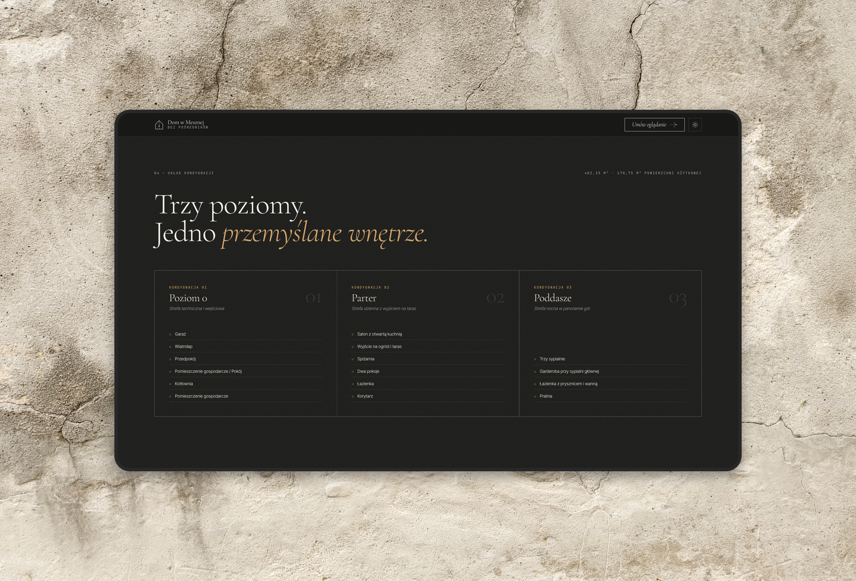
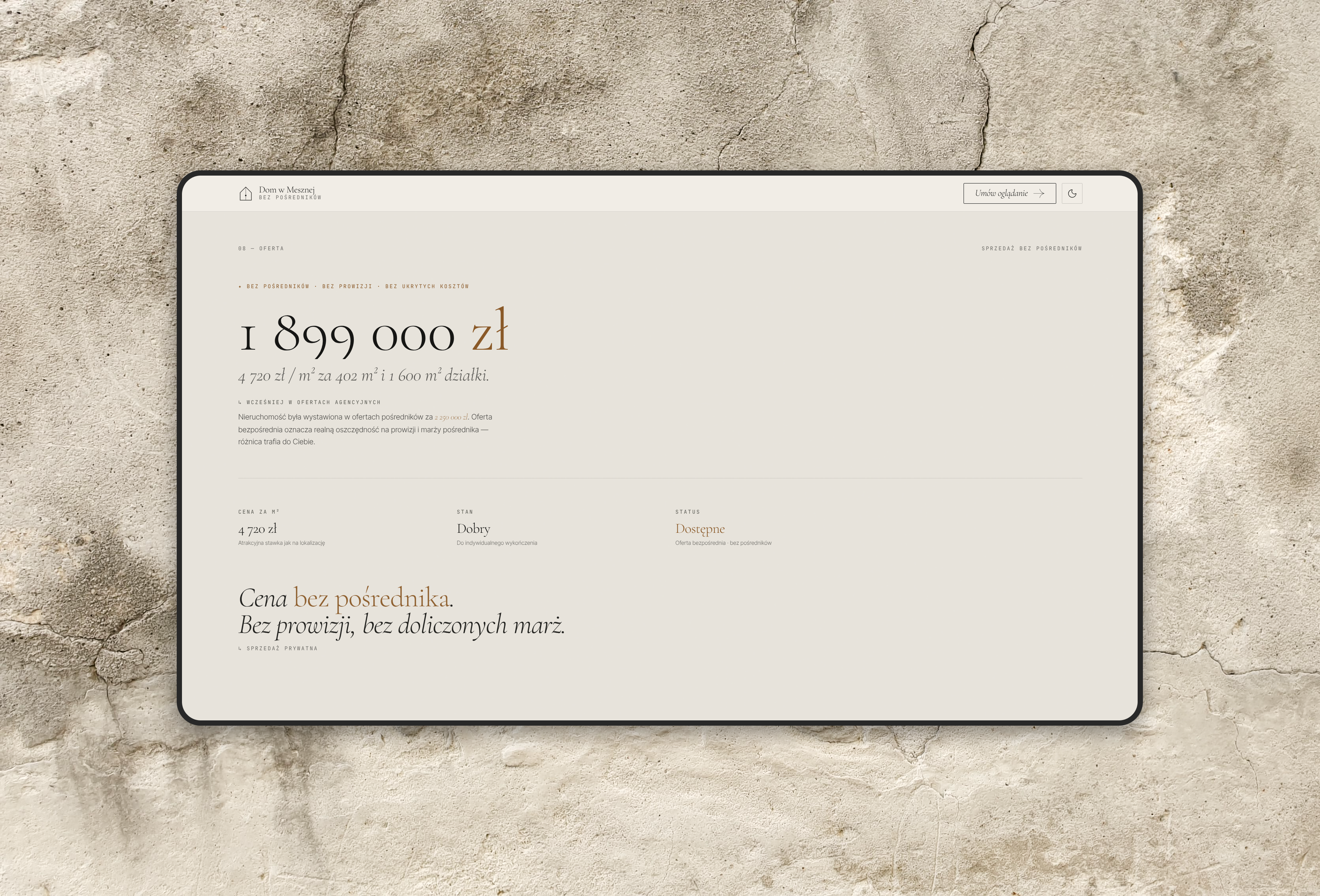
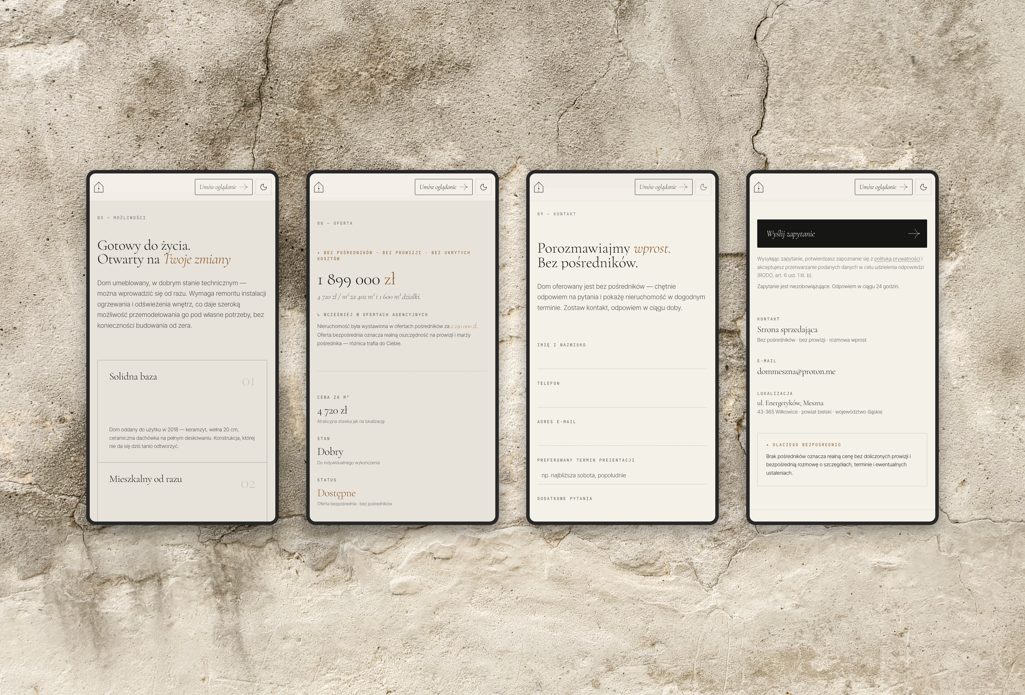
After that the sections run in this order: the house in its landscape, its condition and the work it needs, the three floors, the location and what’s nearby, the interiors, the architect’s plans and the price. The page ends with the form for arranging a viewing. Each section is numbered, so it’s easy to tell where you are on a long page.
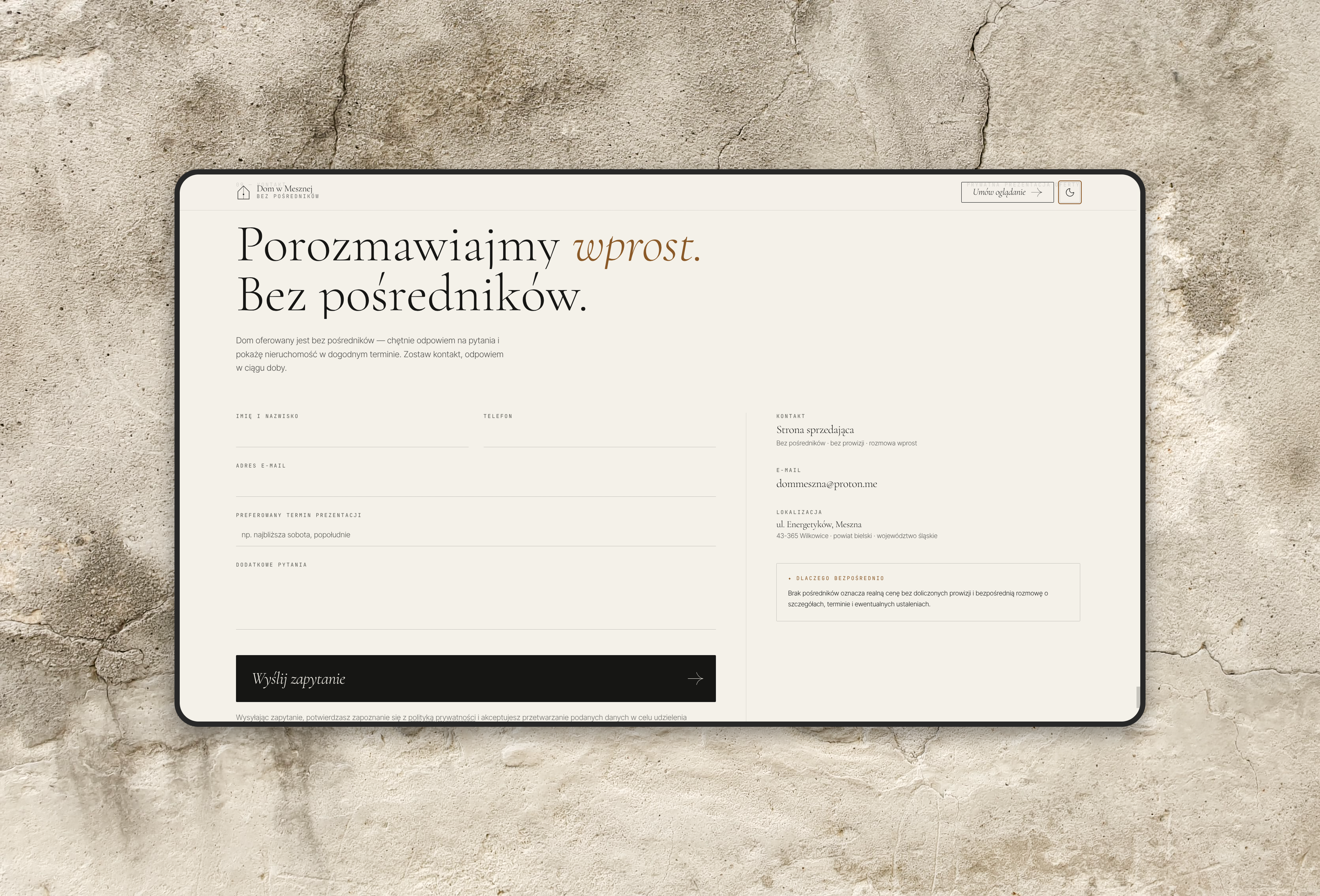
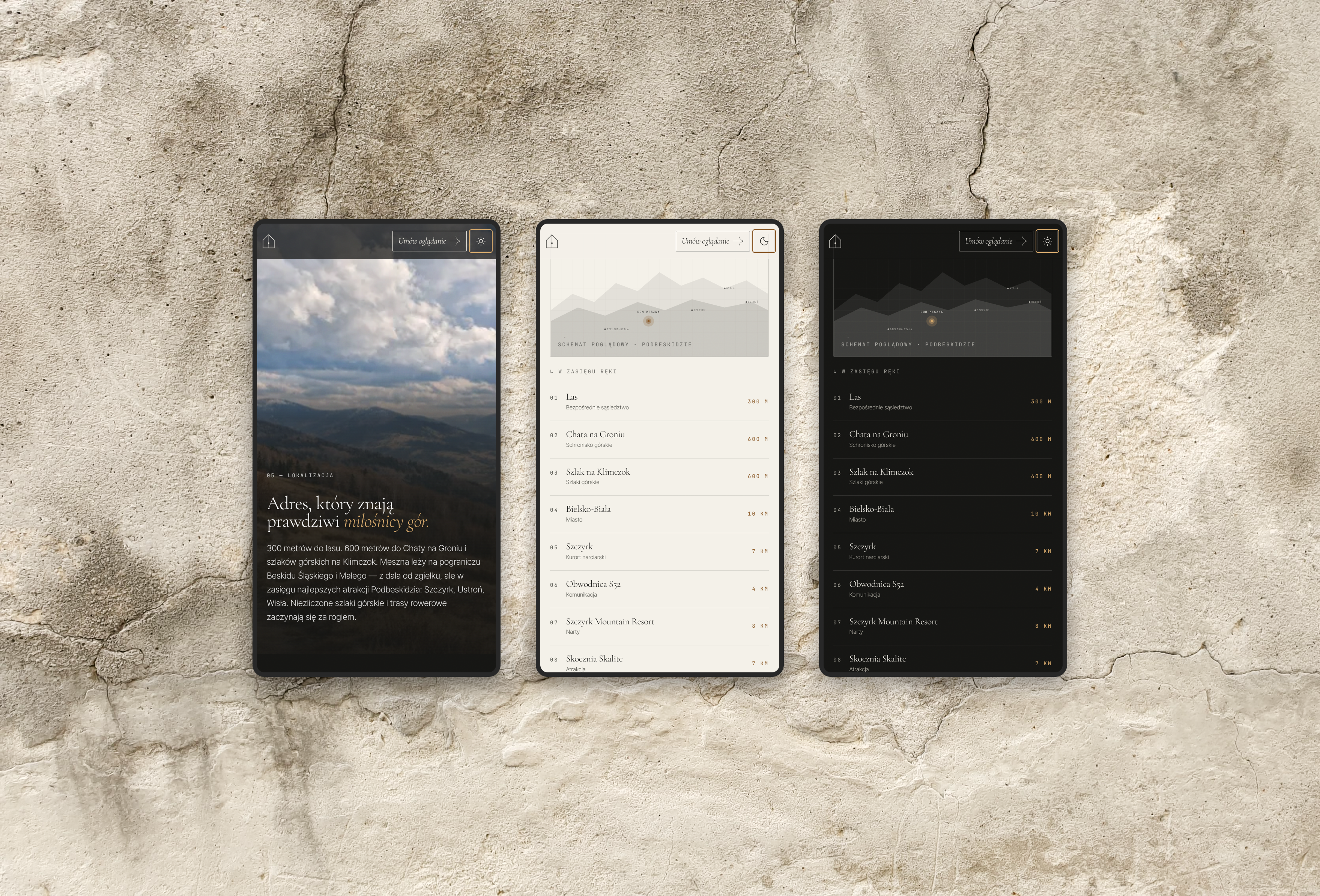
There’s no menu. The header holds one link, “Umów oglądanie” (arrange a viewing), and it stays on screen all the way down the page, on phones too.







UX engineering
The interaction layer supports the experience rather than becoming the experience.
I designed the site and built the frontend in Next.js, React and TypeScript, with Tailwind CSS for styling and GSAP for the animation. Every figure on the site, from the floor area to the price, comes from one data file, so the hero, the key facts, the data for search engines and the social preview image can’t disagree with each other.
The page works without the animation. The price is the clearest example: when you scroll to it, it counts down from the figure agencies had listed the house at to the direct-sale price, and a note underneath explains the difference. With reduced motion turned on, none of this runs and the page simply shows the asking price. The heavier scroll effects only run on large screens.
I designed the phone layouts separately. On a portrait screen the landscape hero photograph crops down to mostly gutter and roof, so phones get a different photograph, taken in portrait, that shows the whole front of the house.
The site targets WCAG 2.2 AA. A Playwright and axe test suite checks it in light and dark mode, at five screen widths from 320px, with reduced motion on and off, and with JavaScript switched off.




Design system
A design system built on tokens that Figma and the code share.
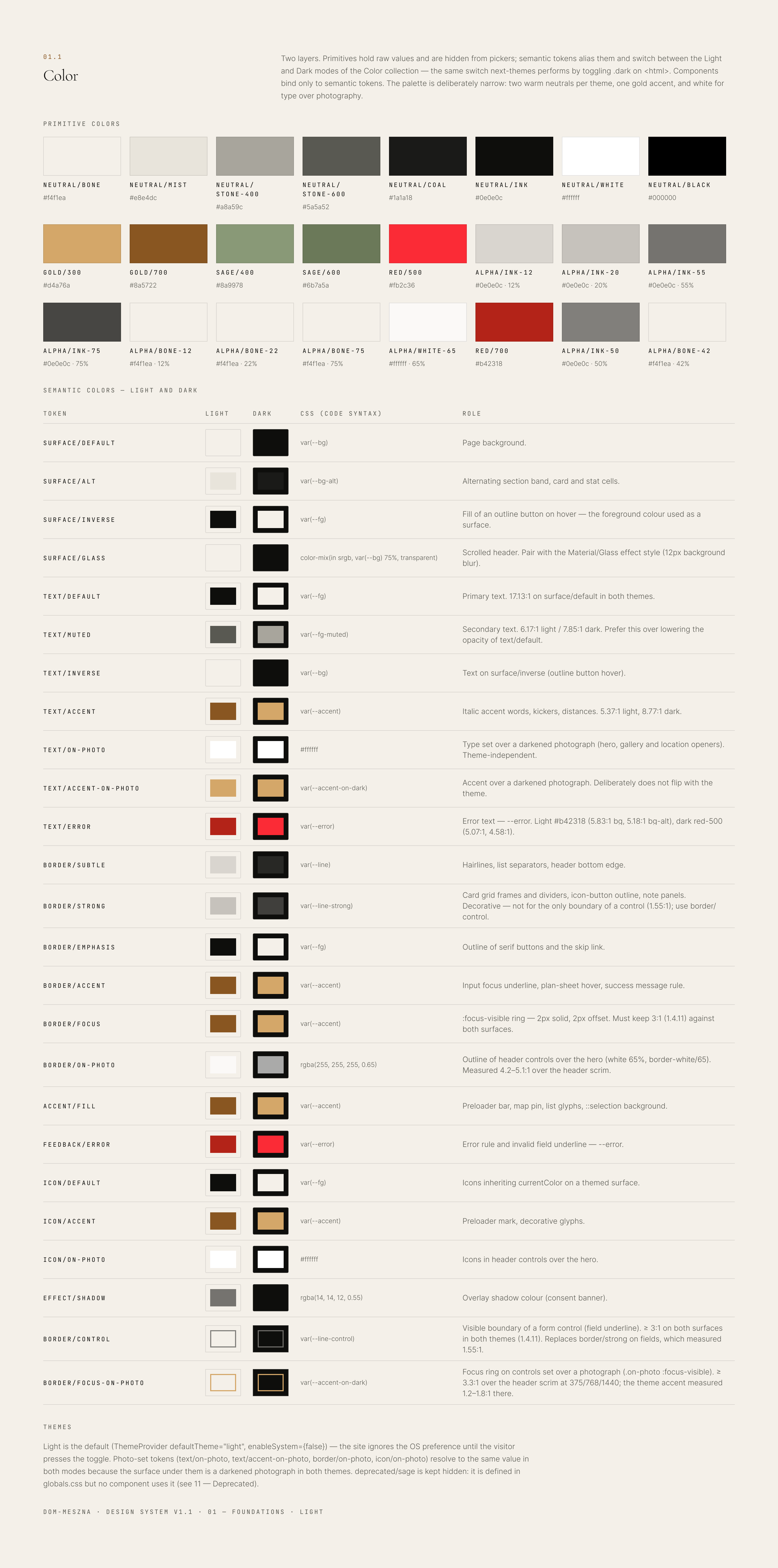
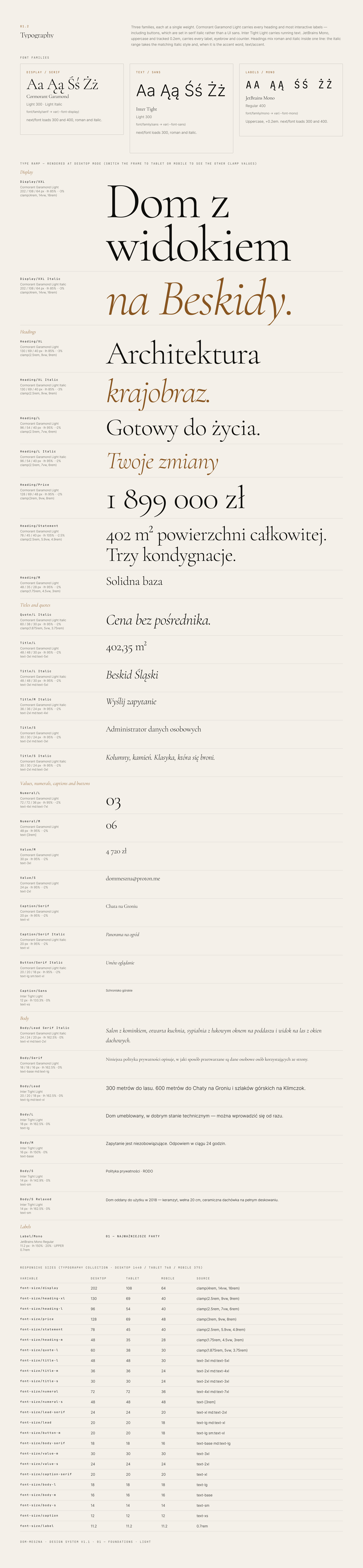
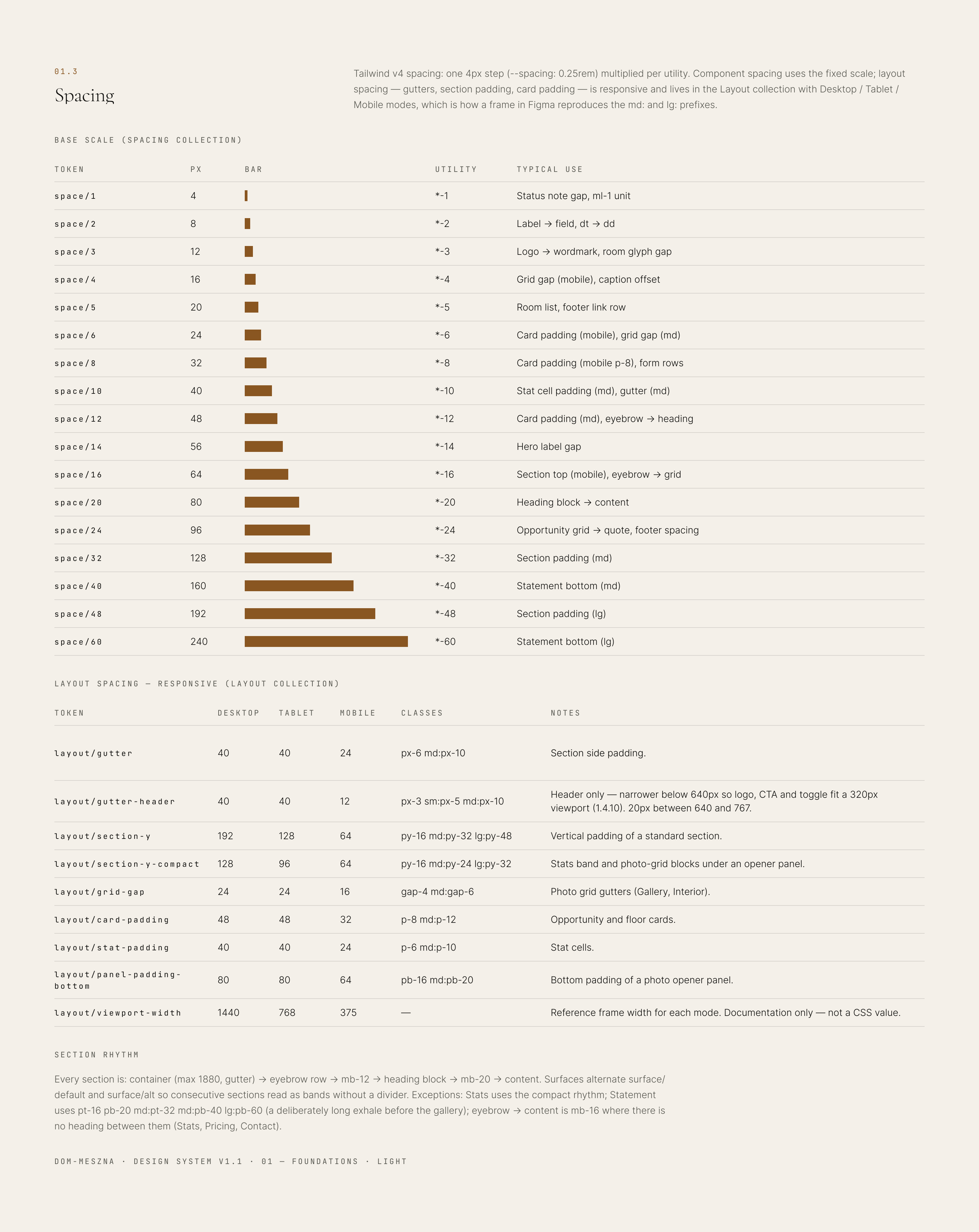
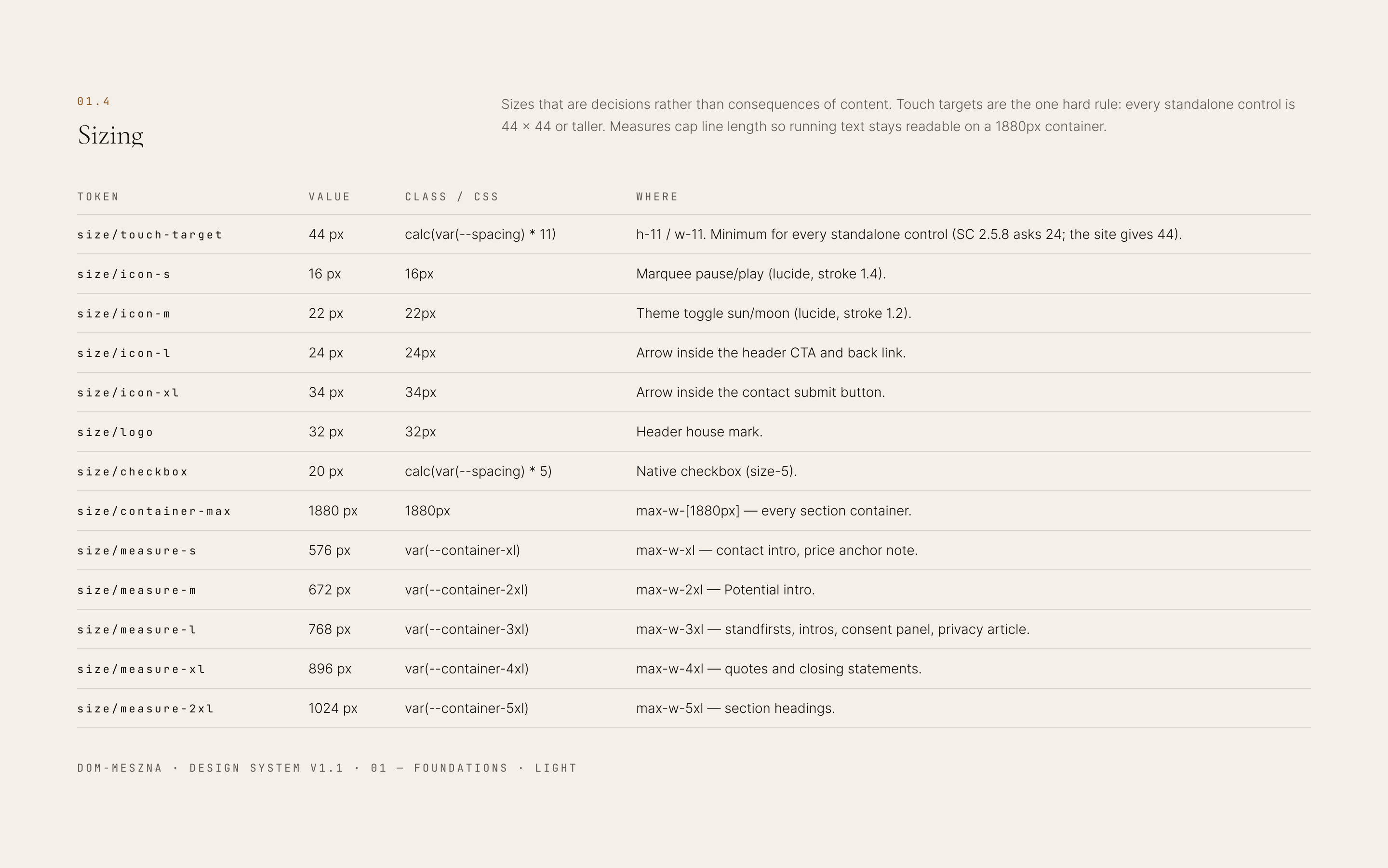
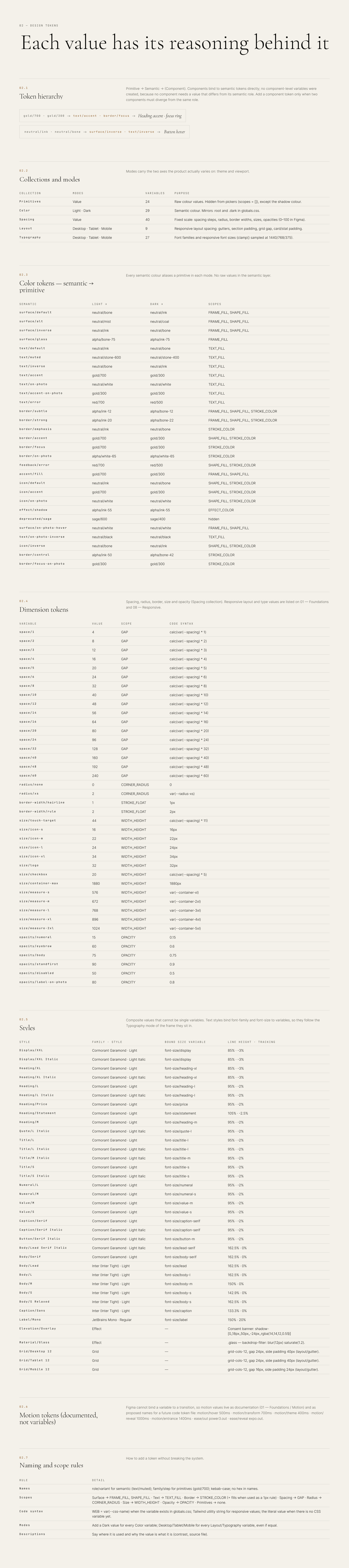
I set the design system up in Figma as variables in five collections: primitives, colour, spacing, layout and typography. Primitives hold the raw values and are hidden from the pickers. Components only use semantic tokens such as text/accent or border/focus, and each token shows the CSS custom property or Tailwind class it maps to.
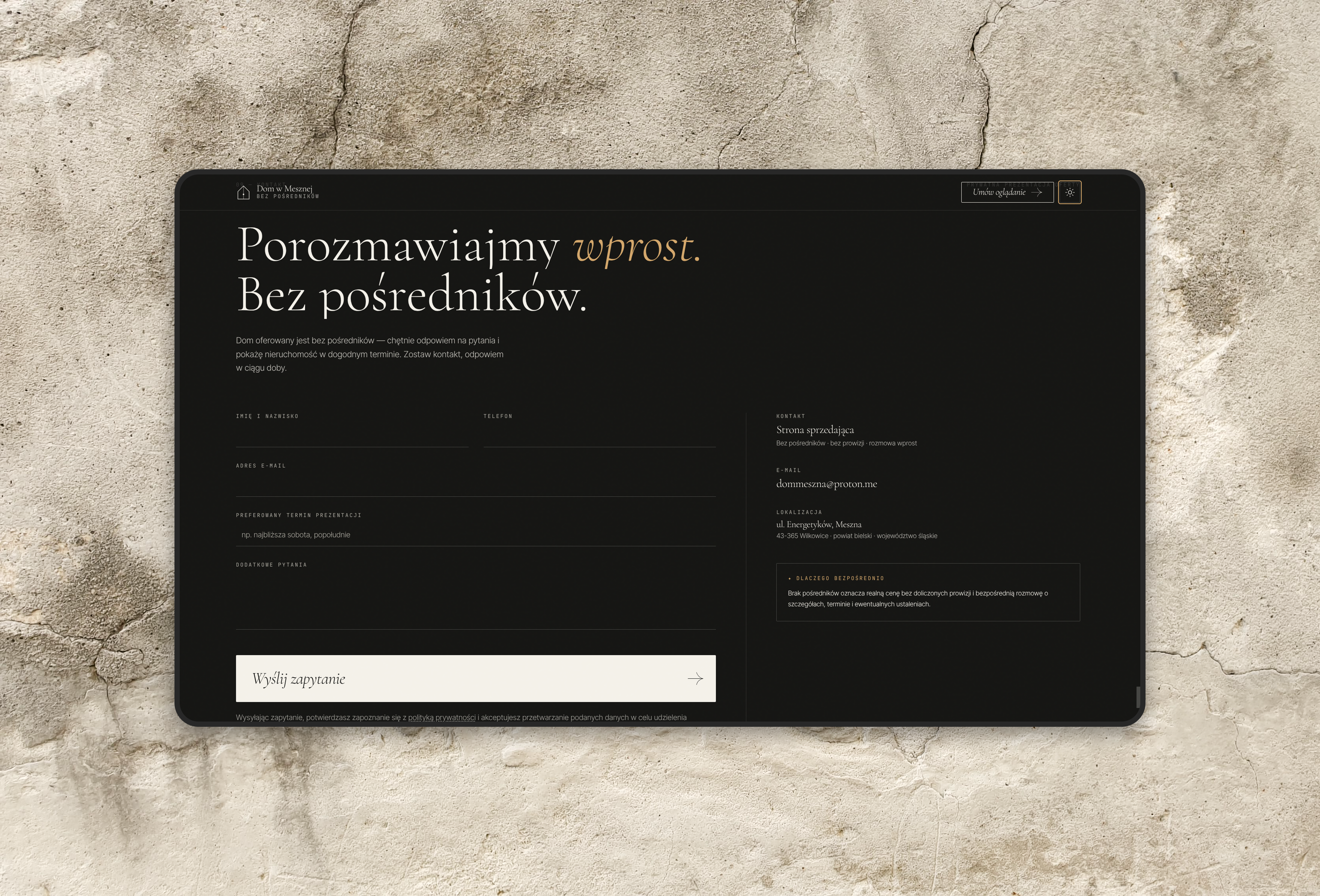
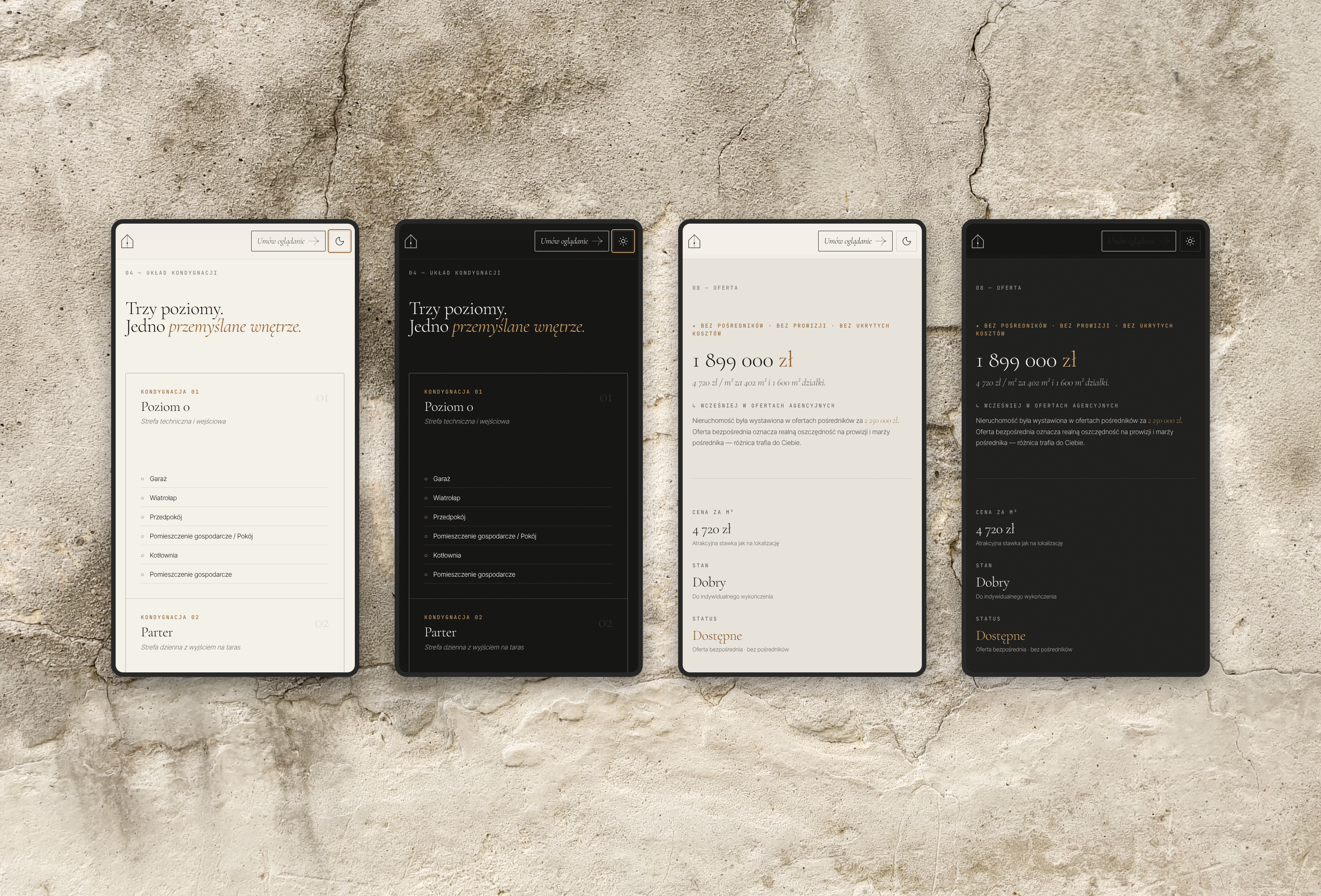
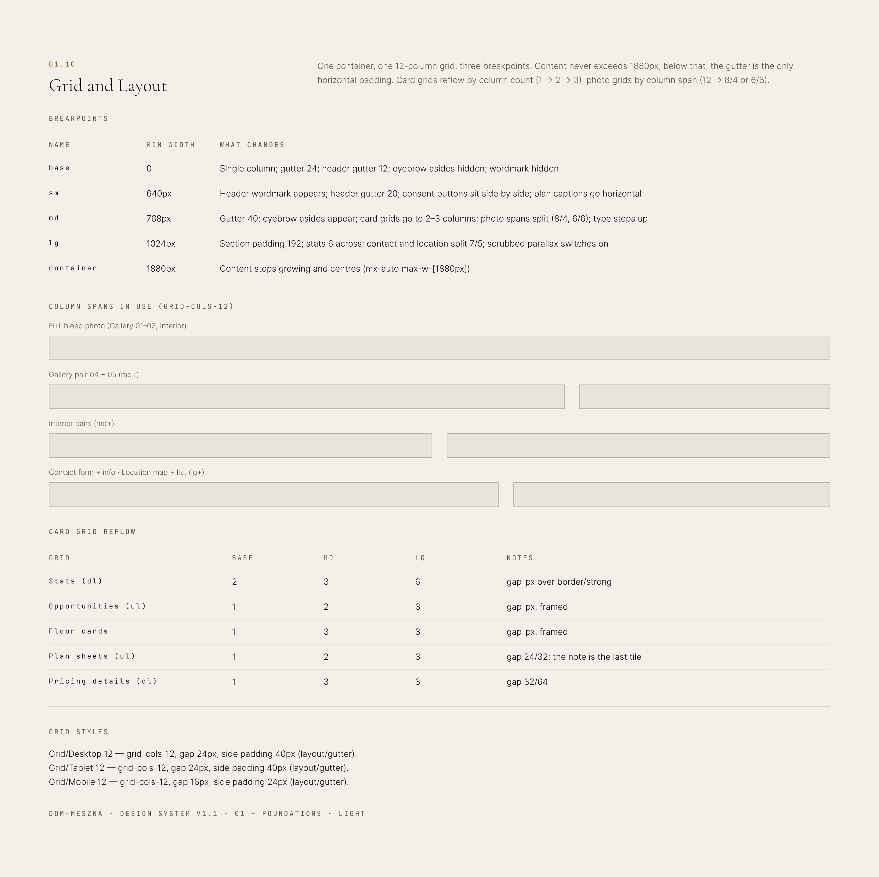
The two things the site varies on are built in as modes. Colour has a light and a dark mode, the same switch the site makes. Layout and typography have desktop, tablet and mobile modes, so a Figma frame picks up the gutters, section padding and type sizes of each breakpoint.
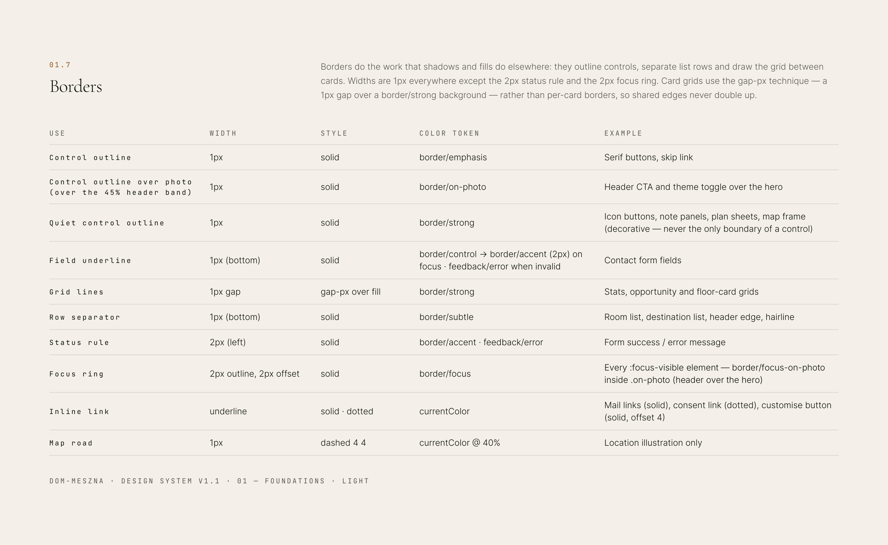
Each token also says why it has its value. Text colours list their contrast in both themes, and form fields have a border token of their own that keeps 3:1 on both backgrounds. Every standalone control is at least 44px, where WCAG asks for 24.







Outcome
A direct-sales experience built around the property, not the platform.
The site is live at dom-meszna.pl. The house has a site to itself, with no other listings around it, and the way to the owner is one tap away from anywhere on the page.
The idea was for the page to do the work of a first viewing, so the people who come to see the house already know its size, its layout, its condition and its price.
It treats the house as the product, and the website as the place where a buyer gets to know it before visiting.